Something significant is happening in design right now, and it goes well beyond surface-level aesthetics. The graphic design trends 2026 is bringing to the forefront reflect a field in genuine transition, shaped by the maturation of AI tools, a cultural hunger for human touch, and a growing fluency in motion as a core brand language.
This is not a year of minor stylistic updates. Designers are navigating a landscape defined by competing forces: hyper-polished AI-assisted visuals sitting alongside raw, imperfect analog aesthetics; rigid grid systems softened by liquid typography and energetic color; nostalgia reframed through a modern lens. Understanding these tensions is what separates designers who follow trends from those who apply them with purpose.
In this post, you will explore the most significant visual movements defining 2026, from motion-first brand identities and bento grid layouts to the punk-influenced analog revival and restrained 3D integration. You will also find practical guidance on applying these trends in regional contexts like Dubai and the Middle East, and on protecting your brand identity throughout. The throughline connecting all of it is human authorship in an increasingly automated world.
Why 2026 Is a Pivotal Year for Graphic Design
The graphic design industry enters 2026 in a more complex position than the headlines suggest. Graphic design budgets are growing despite widespread concern about AI displacing creative roles, and the global market is projected to reach USD 63.2 billion this year, climbing toward USD 110.5 billion by 2036. Business investment in professional visual work is not slowing; it is deepening.
AI adoption is accelerating, but the industry’s position on it has shifted. The question is no longer whether AI will replace designers. The more accurate framing, explored in detail at will AI actually replace graphic designers, is how AI changes what designers do and what brands should expect from them. The emerging consensus positions AI as a generative collaborator for exploration, a tool for rapidly testing visual directions, not a substitute for the strategic judgment that makes design work commercially effective.
Real-world adoption is already operating at scale. Coca-Cola has deployed AI-generated video ads commercially. Fashion labels are experimenting with AI imagery on Instagram. These are not niche experiments; they are mainstream brand decisions made by major marketing teams with significant budgets behind them.
The central tension this creates is not AI versus human creativity. It is synthetic versus authentic. As AI floods digital spaces with technically competent, frictionless visual content, audiences are developing a sharper sensitivity to the difference between work that was made and work that was generated. The most compelling design in 2026 lives at the intersection of both, using AI’s generative speed while grounding the output in human authorship, cultural intelligence, and genuine brand intent.
For any business investing in visual identity, digital presence, or marketing materials, understanding these trends is a commercial decision, not just a creative one.
AI as Generative Collaborator, Not Creative Replacement
That tension between AI as threat and AI as tool has largely resolved itself in professional practice. Today, working designers use AI to accelerate exploration, not to replace the thinking behind it.
In practical terms, AI tools now sit at the front of the design process. Designers use them to generate rapid visual directions, stress-test concepts, and push ideas into territory they might not have reached manually within a tight brief timeline. The output is raw material, not a finished product.
Authorship is where the real differentiation happens. A prompt produces options; a designer produces judgment. The strategic thinking, the understanding of a brand’s audience, the instinct for what feels right versus what merely looks current, none of that transfers to an AI output by default. Human creativity still defines the strategy, and that remains the case regardless of how sophisticated generative tools become.
Commercial precedent confirms AI-assisted design has crossed into the mainstream. Coca-Cola’s AI-generated video campaigns and fashion brands actively experimenting with AI imagery on Instagram are not fringe experiments. They are mainstream executions from major players, which means the conversation has moved on from whether AI belongs in design to how it is being used responsibly.
The risk worth flagging is over-reliance. When AI handles final outputs without strong creative direction, the results tend to converge. Feeds fill with work that is technically competent but visually interchangeable, and brand distinctiveness quietly erodes.
The practical approach that holds up: use AI during ideation and moodboarding, where speed and volume are assets. Then apply deliberate human creative direction to refine, differentiate, and ensure the final work carries the brand’s actual personality and strategic intent, not just an aesthetically plausible version of it.
Motion-First Brand Identity
Where AI handles the ideation phase, the output still needs to move. Literally.
In 2026, motion is no longer layered onto a brand identity after the static system is approved. It is built into the brief from day one. Logos are designed to animate. Colour palettes are selected partly for how they transition. Typographic layouts are constructed to flow rather than sit.
The driver is straightforward: the dominant brand touchpoints are all motion-native. Social media reels, website hero sections, app interfaces, and digital advertising formats all render static assets as flat and passive by comparison. Audiences scrolling through high-velocity content feeds respond to movement before they read a word. A brand that shows up only in static form is, in effect, showing up at half capacity.
What motion-first identity looks like in practice:
- A logo system with a defined animation sequence, not just a still lockup
- A colour palette with specified transition logic, so gradients and shifts feel intentional rather than random
- Typography built on variable fonts that can subtly stretch, soften, or pulse across digital contexts
For brands investing in professional visual identities across Dubai and the wider Middle East, this matters acutely. In high-competition verticals such as real estate, luxury hospitality, and retail, where multiple brands are fighting for the same digital attention, motion branding is a direct differentiation lever. A property developer with an animated brand system commands more perceived authority than one presenting the same static logo across every touchpoint.
Practical application: When briefing a designer, require motion guidelines as a deliverable alongside static brand assets. Ensure your website and social content templates include animated variants from the outset, not as a future upgrade.
Playful Minimalism with Energetic Color Palettes
While motion brings brand systems to life, colour is doing equally significant work in 2026. Minimalism has not disappeared; it has simply stopped being cold.
The sterile, all-white layouts that defined a generation of brand aesthetics are losing ground. Research from Pantone confirms this directly: the brand expanded its Matching System with 224 new vibrant shades in 2026, explicitly linking the move to a “turning point in design” where stark minimalism gives way to bold, expressive colour. Audiences have grown desensitised to neutral palettes and clinical white space. Brands that introduce visual playfulness within a clean framework feel more human, more approachable, and considerably more memorable than those still clinging to beige restraint.
Soft gradients are the most technically significant part of this shift. These are not the garish, over-saturated gradients of early 2000s web design. They are nuanced, layered colour transitions that suggest depth, movement, and tactility without adding visual noise. Google’s updated app icons are a visible mainstream example, moving from flat fills to gentle gradients that shift from pastel to saturated tones. The effect is warmth without complexity.
Bright colours are returning as a deliberate strategic choice, not an accident of trend. WGSN and Coloro’s 2026 forecasts name Electric Fuchsia and Transformative Teal as key colours precisely because they signal energy, confidence, and optimism, qualities that muted, earthy palettes from the early 2020s simply could not project.
Practical application: Audit your current brand palette honestly. If every touchpoint defaults to neutrals, introduce one bold accent colour and build a simple gradient system around it. The layout stays clean; the energy increases significantly. For real-world examples of this approach in action, the brand colour transformation case studies on this site illustrate how strategic colour decisions shift brand perception without disrupting visual coherence.
Liquid and Experimental Typography
Where colour palette choices define energy, typography is now defining personality at a structural level.
In 2026, letterforms are no longer just carriers of information. They stretch, soften, compress, and flow, creating a sense of movement within completely static compositions. A headline can suggest weight, speed, or fluidity without a single animation frame. That expressive shift is what separates typographic design in 2026 from every prior decade.
The technology enabling this is variable fonts. Unlike traditional typefaces that ship as separate static files for each weight and width, variable fonts contain the full range of variation within a single file, allowing designers to pull letterforms across continuous axes of weight, width, slant, and optical size. Combined with creative distortion techniques, this makes type feel genuinely alive rather than mechanically set.
The strategic consequence is significant for brand work. A distinctive typographic treatment can carry as much brand recognition as a logo mark. When a headline style is consistent, expressive, and unmistakably yours, it functions as visual shorthand for brand personality across every campaign application, from a billboard on Sheikh Zayed Road to an Instagram story.
The non-negotiable constraint is legibility. Experimental treatments earn their place at display sizes: hero text, campaign headlines, and pull quotes. The moment liquid typography descends to body copy, it creates friction. Readers tolerate expressive headlines; they abandon expressive paragraphs. Conventional, highly readable type remains the correct choice for anything requiring sustained reading.
Practical application for UAE brands:
- Select or commission a variable typeface with genuine expressive range across weight and width axes
- Apply experimental distortion exclusively at headline level
- Document the typographic rules formally so every designer, in-house or external, applies them consistently across all brand touchpoints
Coherence across applications is what separates a typographic system from a typographic experiment.
The Raw Analog Revival: Zine Culture, Punk, and Deliberate Imperfection
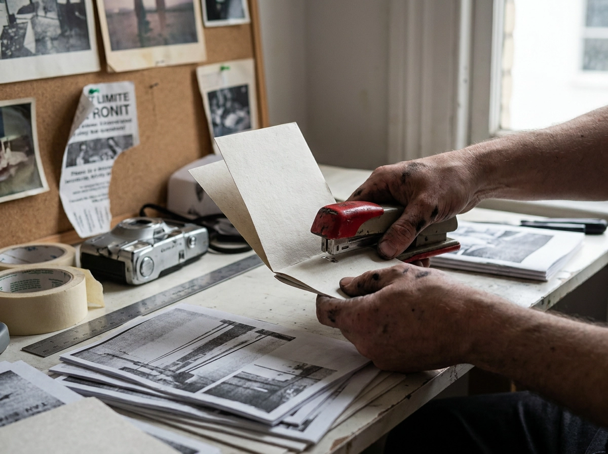
Where experimental typography pushes type to its expressive limits, the analog revival moves in the opposite direction entirely, trading polish for grit.
As AI-generated imagery floods digital spaces with frictionless, algorithmically smooth visuals, a significant countermovement is gaining traction: raw, tactile, deliberately imperfect design rooted in zine culture and punk aesthetics. Forbes notes that 2026 is shaping up as a year defined by analog living, and that cultural shift is landing directly in visual design.
The aesthetic is recognisable: choppy layouts, heavy grain and paper textures, hand-rendered illustration, photocopied treatments, and risograph-style colour separation. Every element signals that a human made deliberate, imperfect choices rather than prompting a model to generate something clean. That is precisely the point.
The cultural logic is straightforward. In an environment saturated with synthetic, near-identical content, imperfection signals humanity. Handmade visual language builds trust and emotional connection in ways that polished AI outputs simply cannot replicate, because the flaws themselves carry meaning.
Brands adopting this direction tend to be those where authenticity and cultural credibility are non-negotiable: independent food and beverage labels, music and entertainment, fashion, and creative agencies. These are audiences who can detect manufactured “rawness” immediately, so the execution has to be genuine rather than a surface treatment applied over a corporate framework.
For practical application, start small: introduce analog texture overlays into campaign graphics, incorporate hand-drawn illustrative elements into social content, or introduce intentional irregularity into layout compositions. Explore more approaches across the design work and thinking on this site.
The goal is tactile contrast. In a digital-first world, feeling genuinely human is a competitive advantage.
Nostalgic Visual References with a Modern Frame
Where the analog revival draws on texture and imperfection as a rejection of synthetic polish, nostalgic design in 2026 operates differently: it uses historical visual vocabulary deliberately, as a credibility signal and a differentiator.
Nostalgia is now a strategic tool, not a stylistic mood. Designers are mining punk and grunge references from the 1980s and 1990s alongside medieval and pre-modern symbolism to produce work that registers as both familiar and distinctly contemporary. These are not retro projects; they are modern design systems that borrow selectively from history to carry emotional and cultural weight.
Medieval-modern symbolism is particularly active in brand identity work. Crests, heraldic forms, gothic lettering, and archival illustration styles are appearing across sectors where brands want to signal heritage, craft, quality, or exclusivity. A premium food producer, an independent spirits label, or a luxury service brand can use this visual language to imply depth and provenance that a clean, templated digital identity simply cannot manufacture.
The strategic logic is straightforward: in a market saturated with brands built from the same digital tools and the same template libraries, historical visual vocabulary signals intention, originality, and considered authorship. That builds audience trust before a single word of copy is read. Brands working with minimal and refined visual systems can use a single historical reference, a hand-engraved illustration style or a heraldic badge element, to inject character without abandoning restraint.
The execution risk is pastiche. Reproducing a historical aesthetic wholesale, without modern reframing, produces work that feels derivative rather than inspired. The strongest executions extract two or three specific visual elements from a chosen era and integrate them into contemporary color systems, digital-native layouts, and responsive applications.
Practical application: identify which historical period aligns with your brand’s core values. Extract specific visual elements from that era. Build them into an otherwise modern design system to create genuine tension and character.
Bento Grid Layouts and Modular Design Systems
Where nostalgic design draws from the past to build character, bento grid layouts achieve something different: they bring structural intelligence to complex, content-rich visual communication.
Named for the segmented Japanese lunch box, bento grids organise content into modular, asymmetric sections that feel structured without being rigid. Each cell holds a distinct content type, text, image, data point, or call to action, while the overall composition reads as a unified whole. The result is high information density without visual overwhelm.
Why this layout has become dominant across digital environments:
- Website design: Homepage hero sections and feature overviews communicate multiple offerings simultaneously, without forcing users through linear scrolling
- App interfaces: Modular panels allow varied content types to coexist without hierarchy conflicts
- Social media grid planning: Bento thinking applied to Instagram or LinkedIn grids creates cohesive visual systems across individual posts
- Digital presentations: Slide layouts gain visual interest and clarity when content is compartmentalised rather than listed
The strategic case for bento grids rests on scalability. A well-constructed modular system adapts gracefully across screen sizes and content volumes. Cells reflow rather than break, making it inherently responsive in ways that rigid column layouts often are not.
For businesses with diverse product or service portfolios, this matters considerably. Trying to communicate multiple value propositions in a standard layout typically produces visual clutter or forces awkward prioritisation choices. A bento structure solves this by giving each proposition its own defined space within a cohesive field, letting audiences scan and self-select without confusion.
Practical application: When planning a website redesign or refreshing marketing collateral, test bento grid structures against your standard column layouts, specifically for homepage hero sections, feature or services overviews, and portfolio presentations. The structured asymmetry tends to feel both organised and dynamic, which is a combination that standard grids rarely achieve.
Restrained 3D Integration: Stylization Over Spectacle
Where bento grids bring structural clarity to layout, 3D design is navigating a different kind of discipline: knowing when to pull back.
The hyperrealistic 3D rendering that dominated brand work in the early 2020s has lost its edge. Audiences have seen enough technically flawless chrome spheres and glass-smooth product renders to recognise the formula. Photorealism no longer reads as sophisticated; it reads as effortful. Brands still leaning heavily on it risk looking over-produced against the cleaner, more purposeful visual language defining 2026.
The shift is not away from 3D itself but toward how it is used. Stylized, illustrative 3D is now the more credible choice: soft clay-like objects, abstract sculptural forms, and dimensional type treatments that add genuine depth without asking the viewer to stop and appreciate the technical achievement. The dimension serves the composition quietly rather than announcing itself.
Integration is the operative principle. Effective 3D in 2026 does not exist as a standalone showpiece. It sits within a wider visual system, complementing flat graphic elements, photography, and motion design as part of a unified identity rather than competing with them for attention. This is a meaningful distinction. A 3D element that shares the same colour palette, texture language, and tonal register as the rest of a brand’s assets feels considered. One that exists in isolation, however polished, feels like a separate project.
This connects directly to the broader purpose of brand-focused design: every element, including dimension, should serve the identity rather than showcase a capability.
Practical application: If 3D is appropriate for your brand, commission stylized renders rather than photorealistic ones, align colour and texture with your existing visual identity, and use dimension to direct attention, not to impress.
How These Trends Apply in Dubai and the Middle East
Global design trends do not arrive in Dubai the same way they do in London or New York. Dubai’s visual culture sits at a specific intersection: internationally influenced, commercially driven, and regionally grounded in ways that reshape how each trend actually lands in practice.
Motion-first branding and bento grid layouts are being adopted rapidly across Dubai’s highest-competition sectors. In real estate, luxury hospitality, F&B, and fintech, a digital-first brand presence is a direct commercial asset, not a creative preference. Brands in these verticals are moving fast because standing still, visually, is a competitive liability.
The analog revival and nostalgia trend carry particular regional weight here. Middle Eastern calligraphic traditions, Islamic geometric patterns, and archival visual references from the Arab world represent a largely underused source of design authenticity. Where Western brands are reaching back to punk zines and grunge for cultural texture, GCC brands have access to a far richer, more distinctive visual heritage. The opportunity is not imitation of a global aesthetic; it is reinterpretation of something genuinely local.
AI as a generative collaborator fits the pace of this market well. Agencies and freelancers serving Dubai’s fast-moving marketing environment face constant pressure to reach concept stage quickly. AI accelerates that phase. But for premium clients across the Gulf, brand distinctiveness is non-negotiable, which means AI-assisted speed must be paired with human creative judgment to avoid producing generic outputs that undermine positioning.
The broader strategic opportunity for brands across Dubai and the GCC in 2026 is straightforward: combine global trend fluency with regional cultural specificity. Work that achieves both feels contemporary to an international audience and genuinely rooted to a local one. That combination is rare, and as a graphic designer and brand specialist based in Dubai, it is where the most impactful work gets made.
How to Use These Trends Without Losing Your Brand Identity
Knowing which trends apply to your market is only half the equation. The harder question is how to apply them without dissolving the brand equity you have already built.
The most common mistake is adoption without interrogation. Brands see a trend gaining traction and replicate the aesthetic because it looks current, without asking whether it actually serves their positioning, their audience, or their long-term identity. The result is a brand that looks temporarily fashionable and permanently generic.
Apply this filter before acting on any trend: ask whether it amplifies what your brand already stands for, or whether it simply makes you look like every other brand in your category chasing the same reference. If the honest answer is the latter, the trend is not working for you; it is working against you.
Use trends as a creative lens, not a template. Liquid typography, for instance, does not require a wholesale typographic rebrand. It might simply inspire a more expressive, fluid treatment of your headline font, one that adds personality while preserving recognition. The trend informs the direction; your brand governs the execution.
Brand consistency carries more commercial weight than visual trend alignment. Research from Kantar confirms that brands deploying consistent visual and sonic cues over time build significantly stronger brand recognition, and 81% of consumers require trust before making a purchase. A timeless, well-executed identity builds that trust systematically. A trend-chasing rebrand resets it.
The designer you work with determines how well this balance holds. A practitioner who understands global trend fluency and your specific market context, your audience, your competitors, your category, can produce work that feels current without being disposable. Trends should give your brand a sharper edge, not a borrowed identity.
The Through-Line: Human Authorship in an AI-Accelerated World
Across every trend covered in this article, a single thread runs through all eight: the tension between synthetic and authentic. Motion branding, analog revival, experimental typography, restrained 3D, none of these movements exist in isolation. They are all responses to the same underlying shift in how audiences experience visual content, and how brands either earn trust or dissolve into the noise.
The brands winning in 2026 are not those that have abandoned AI, nor those that have surrendered to it. They are the ones navigating that tension deliberately, using AI as a generative tool for speed and exploration while applying human judgment, cultural intelligence, and strategic clarity to every output that represents the brand.
That distinction matters because it is not a philosophical point; it is a commercial one. Design budgets are growing. Businesses are embedding design deeper into their operations, not as a production function but as a strategic one. That signals that the market already understands what is at stake: distinctive, human-authored visual identity is a business asset, not a cosmetic expense.
The opportunity is real. Whether you are launching a new brand, refreshing a visual identity that no longer reflects where your business has grown, or building a digital presence in Dubai or across the wider GCC, the goal is the same. Design that does more than look current. Design that builds trust, communicates clearly, and drives measurable results.
If you are ready to apply these trends strategically rather than decoratively, explore the brand identity, web design, and digital marketing services built for exactly that purpose. The tools have never been more powerful. The need for human direction has never been greater.
Conclusion
The visual landscape of 2026 rewards clarity, intention, and humanity. AI accelerates the creative process, but human judgment determines whether the output actually builds trust. Motion, typography, color, and layout are no longer decorative choices; they are strategic ones that directly affect how audiences perceive and remember a brand.
The trends covered here share a single thread: audiences are drawn to design that feels authored, not generated. That authenticity is your competitive edge.
Whether you are building a brand from the ground up or evolving one that has outgrown its current identity, the moment to act is now. The tools are exceptional. The standards are higher than ever. Apply these trends with purpose, not as decoration.
Ready to turn visual strategy into measurable business results? Explore brand identity and design services built to do exactly that.
Related Reading
Building a Strong Brand Identity Through Visual Consistency · Color Psychology in Branding · AI in Graphic Design · Graphic Design Portfolio Guide
Related Reading
Building a Strong Brand Identity Through Visual Consistency · Color Psychology in Branding · AI in Graphic Design · Graphic Design Portfolio Guide