Most brand identity design projects are judged at the wrong moment. The logo approval meeting feels decisive, but it is often the easiest part of the job. By the time a mark is presented in a Dubai brand identity project, dozens of choices have already been made: how the name sits in a lockup, how Arabic and English share a visual hierarchy, which colours have a functional role, and how type is governed across an entire system. Those decisions are where the budget is actually earned, and where weak processes quietly unravel.
This post is an annotated walk-through of one real engagement, not another checklist of what to look for in a designer. You will see the sequence of decisions and the artefacts a buyer should be able to point to at each stage. We start with the setup that made the logo the easy part, then move through decision one on naming and the lockup grid, decision two on Arabic and English hierarchy, decision three on colour with a job to do, decision four on type as a rule, and decision five on the application kit that proves the system. We close with the artefacts test, what I would do differently, and why you should approve the system, not the logo.
The Setup That Made the Logo the Easy Part
The brief arrived as “a logo and maybe a colour.” That is not a small job; it is an undefined scope. Four unknowns shaped the engagement before any drawing began: no agreed Arabic wordmark, no descriptor line, no stated split between Arabic-first and English-first audiences, and no rules for how the brand should behave on signage or in an app icon.
Here is my practitioner position, not a research finding: a logo is an output. The system decides what that logo is allowed to do at every size and on every surface. A logo-only route would have broken first at the bilingual invoice, then the 16px app icon, then the shopfront fascia, then the vehicle decal. In Dubai, logos on façades and vehicles are regulated advertising content, which is exactly why the rules must exist before the artwork (Dubai advertising decree%20of%202020%20Regulating%20Advertisements%20in%20the%20Emirate%20of%20Dubai.html)).
Free SEO audit
Want me to check this on your website?
I'll review your site and send you the top fixes for more Google visibility and enquiries, within 1 business day. Free, with no obligation.
Get My Free SEO AuditChat on WhatsAppThis is one anonymised Dubai brand identity engagement, walked through decision by decision, with the artefact you should expect at each stage. The work sits in my brand identity design and graphic design practice in Dubai. Client sector and size are named only at the level agreed, and some details have been changed to protect confidentiality. If you have approved a logo before and felt the result was thin, The Logo Is Not the Brand. It Is the Starting Point. explains why that happens.
Decision 1: Naming and the Lockup Grid
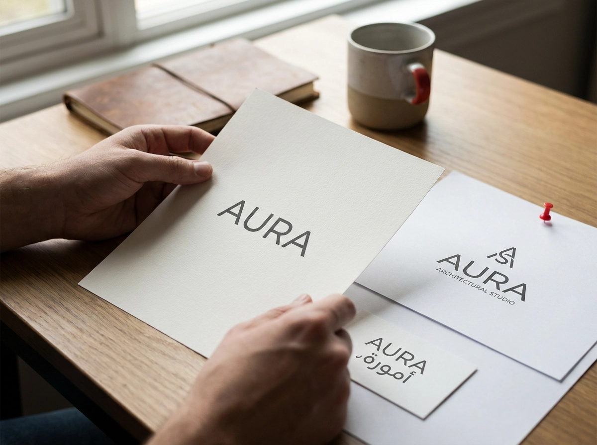
The first fork wasn’t the drawing. It was whether the wordmark alone carried enough meaning, or needed a descriptor line, a monogram, an Arabic counterpart, or a combination that could be stacked and unstaked.
We tested each on real surfaces. Horizontal for signage, stacked for the invoice header and social profile, icon only for the 16px app slot, and an Arabic led arrangement for the fascia where most footfall reads Arabic first. Minimum clear space was set at the height of the Arabic letterform’s ascender, and the smallest usable size locked at 14mm in print and 24px on screen.
What you should be able to point to
One lockup grid: every approved arrangement on a single page, plus a restraint page showing no stretching, no recolouring, no freestanding letterforms.
One honesty clause: confirm the wordmark is clear for use before anyone falls in love with it. Trademark filing in the UAE sits with the Ministry of Economy, and that check belongs before the grid, not after.
If that sequencing feels familiar, it is the same trap covered in adding Arabic as an afterthought instead of building it in parallel.
The lockup grid is your first real test. With one, nobody reinterprets the mark next month. Without one, you bought a drawing.
Decision 2: Arabic and English Hierarchy
With the lockup grid settled, the next fork was strategic, not typographic: was Arabic a translation of the English identity, a co-equal partner, or the lead element? We committed to a surface rule. Arabic leads on shopfront and packaging; English leads in the website hero and social profile, with Arabic co-equal; Arabic leads on official documents, where we record which signed text governs, because equivalent-looking Arabic and English wording can carry different meaning, as UAE legal commentary on Arabic and English wording notes. No surface is left to the designer of the day.
We matched type by visual weight and x-height equivalent, never point size, since the scripts have different vertical proportions. The common mistake is choosing a Latin face first and then hunting an Arabic lookalike; select or commission both together.
The artefact is a bilingual specimen sheet showing this hierarchy on every real surface, with right-to-left mirroring rules, alignment rules, numeral setting and bilingual contact details. That same hierarchy carries into social templates, as this guide to marketing for social media in the UAE explains.
Decision 3: Colour With a Job to Do
With the bilingual specimen locked, the palette was next, and the fork was simple: three attractive swatches on a moodboard, or colours with assigned roles. The first option collapses the moment another designer opens a file, because nothing tells them which blue means action and which is merely decorative.
We chose roles. A primary carried recognition, a secondary supported it, and functional colours handled action, alert, success and background, each with a stated purpose. The boring decisions protected the system: text contrast on brand colour, print versus screen behaviour, and drift between CMYK, RGB and spot values. Body text needs 4.5:1 contrast and large text 3:1 (W3C guidance); logotypes are exempt, but interface copy is not.
The artefact was a colour token sheet: named colours, not bare hex codes, with print and screen values, usage proportions, and approved and unapproved pairings. This is where a documented colour selection process earns its keep.
Without written rules, a palette quietly becomes whatever the last designer felt like, and social templates show it first.
Decision 4: Type as a Rule, Not a Choice
Colour assigned roles. Type assigns behaviour. The fork was pairing two faces because they looked good, or building a hierarchy the client’s team could apply without asking. We chose the scale: heading, subheading, body and interface sizes, each with stated line heights, weight limits, casing rules and a minimum size.
Rules matter more at 11px than at 60px. Footers, app icons, invoice headers and Instagram bios expose an ungoverned system. A minimum size and casing rule stop those surfaces becoming someone’s guess. For digital layouts, text must also survive spacing overrides of 1.5 line height and 0.12em letter spacing, as set out in the W3C text spacing guidance.
Arabic changes the rules. Increase line height, never apply letter spacing, and use weight differently because Arabic counters close up faster. Most bilingual systems fail here quietly.
The artefact is a type specimen: the scale on real layouts, the pairings in use, and one page of failures. Showing what not to do is faster than explaining what to do, much like liquid and experimental typography needs context before application. That specimen is what stops typography becoming a choice again.
Decision 5: The Application Kit That Proves the System
Type rules mean nothing until they hit real surfaces. That is the fork in the road at handoff: a folder of source files, or a kit someone else can run without calling you. The first asks the client to interpret. The second documents the decisions already made.
What shipped here was practical: stationery, a signage and fascia specification, social templates, a presentation template, email signature, invoice layout, and the web components the site was built from. Each item traces back to a rule from earlier decisions, not a one-off layout.
The artefact is the kit index. It lists every file, its format, where it lives, who owns it, and which version is current. Without it, an asset library becomes a folder of old logos within a year. The five components a complete service should deliver belong in that index, not just in the pitch.
Digital application is where a working system gets proven. A business card does not test an identity. A live website does. Responsive components, hover states, mobile icons and forms all expose whether the rules hold. This is where web design connects back to the identity.
Files are not the system. The rules are. A tidy zip of PNGs with no decision behind it is a logo pack, not a brand identity.
The Artefacts Test: How to Judge a Brand Identity in Dubai
The kit index closes the sequence, and it hands you a way to audit any supplier. Apply the same test at every stage: at naming, a lockup grid; at hierarchy, a bilingual specimen; at colour, a token sheet; at type, a scale on real layouts; at handoff, a kit index. If a stage has no artefact, ask why.
Weak answers are easy to hear. “We will sort the Arabic later” usually means nobody has budgeted the rework. “The palette is flexible” means no rules exist. “You will get all the logo files” means you are buying an image, not a system. “Guidelines can come in phase two” usually means they never arrive.
A strong handoff is quieter: locked source files with sensible naming, plus a guidelines document short enough that staff actually read it, written in plain language rather than design jargon.
Judge the decision record, not the moodboard. Ask each shortlisted branding agency in Dubai or graphic design agency in Dubai to show a lockup grid and a bilingual specimen from a past project; my own graphic design services in Dubai follow that same sequence. On signage, Dubai’s tightened shopfront rules require Arabic above English and one trade name only, so the bilingual specimen is a permit-stage document, not a styling choice.
Timing and cost, plainly: these decisions are cheapest at kickoff and most expensive after launch.
What I Would Do Differently
Here is the part I would change. We approved the primary lockup before the Arabic wordmark was set. At the time it felt like momentum; in practice, once the Arabic counterpart arrived, the horizontal arrangement no longer balanced. That single sequencing error triggered three revision rounds and a reissued stationery set, and every one of those rounds was avoidable.
Colour nearly repeated the mistake. The tokens were locked only after the first social templates had been built, so those templates were rebuilt as well.
What the client’s team needed was not more file formats. They needed a short training session on the rules and a two-page internal reference they could open before a campaign, in plain language rather than design jargon.
The shortcut to avoid is approving the logo in isolation and treating the rules as admin to be finalised later. Once the reveal applause fades, nobody owns that admin, and each campaign restarts the same argument.
Decisions documented early are cheaper than decisions relitigated late. The document is what stops the conversation returning at every launch. It is also why I now point clients toward a clear decision model on what to keep in-house and what to outsource, because governance starts well before the first file is drawn.
Approve the System, Not the Logo
That lesson points to a simple test for any identity review. Request five artefacts: a lockup grid, a bilingual specimen, a colour token sheet, a type scale shown on real layouts, and a kit index. Before your next review, list those five and mark which exist and which are still verbal promises. If you are commissioning brand identity design in Dubai, or shortlisting a branding agency in Dubai or a graphic design agency in Dubai, judge the decision record rather than the reveal. At each meeting, ask which decision was made and where it is written down. The logo is the first thing people see, but the documented decisions are what make it work on every other surface, in both languages, for the next five years. If you want this sequence walked through for your own business, Kiampi Daniel works on brand identity design, graphic design and web design from Dubai.
Conclusion
A strong Dubai brand identity is less about the reveal and more about the record behind it. Document decisions early, because naming, bilingual hierarchy, colour roles and type rules are far cheaper to agree now than to relitigate at every launch. Judge progress with the five artefacts, not applause: a lockup grid, bilingual specimen, colour token sheet, type scale on real layouts and a kit index. Above all, approve the system, not the logo, since the logo is only the first surface it has to survive.
Your next step is simple. At your next review, ask which decision was made and where it is written down. If you would like that sequence walked through for your own business, Kiampi Daniel works on brand identity design, graphic design and web design from Dubai. Start with the document, and the confidence follows.
Need help putting this into practice?
I help businesses in Dubai and Sharjah get found on Google and turn visitors into customers. Start with a free audit, or see my fixed-price packages.
Get My Free SEO AuditSee Packages & Pricing